Example 1: Working With Graphs
Question 1
6 A teacher shows his class how to investigate the half-life of a radioactive source.
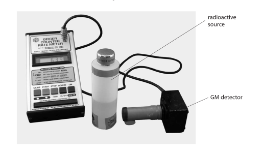
Every half a minute, the teacher records the count rate.
He corrects for background radiation and produces this results table.
| Time in minutes |
Corrected count rate in Bq |
|---|---|
| 0 | 49 |
| 0.5 | 30 |
| 1.0 | 24 |
| 1.5 | 18 |
| 2.0 | 15 |
| 2.5 | 11 |
| 3.0 | 10 |
| 3.5 | 9 |
| 4.0 | 5 |
| 4.5 | 6 |
Draw a graph of corrected count rate against time for these results.
Final answer
Plot corrected count rate against time and draw one smooth curve through the points:
Mark scheme points
- M1 Use suitable, even scales that cover all the results on both axes.
- M2 Label both axes with the correct quantity and unit: time in minutes and corrected count rate in Bq.
- M3 Plot the data points at their correct coordinates.
- M4 Include the complete set of results, including the final points at 4.0 min and 4.5 min.
- M5 Draw one single smooth curve through the plotted points.
Explanation
Time is the independent variable, so it is placed on the horizontal axis. Corrected count rate is placed on the vertical axis. A linear scale from 0 to 5.0 min and from 0 to 50 Bq uses the graph space well and includes every value.
Plot each ordered pair from the table, such as (0 min, 49 Bq), (0.5 min, 30 Bq), and (4.5 min, 6 Bq). The count rate generally decreases, but the final value rises slightly from 5 Bq at 4.0 min to 6 Bq at 4.5 min, so both final points must be plotted accurately. Join the points with one smooth curve rather than separate straight-line sections.
Common mistakes
- Putting time on the vertical axis or corrected count rate on the horizontal axis.
- Leaving out the units, or using an uneven scale.
- Missing the close final points, especially (4.0, 5) and (4.5, 6).
- Joining points with a series of straight segments or drawing several separate curves instead of one smooth curve.
